“Simplicity is the ultimate sophistication.” — Leonardo da Vinci
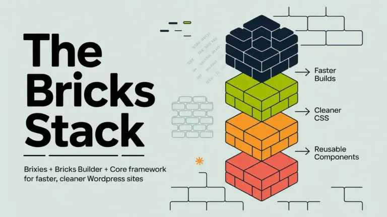
This introduction outlines a practical workflow for building faster, cleaner websites by combining a layout library, a visual editor, and a variable-driven design layer. The stack reduces one-off styles, cuts repeated manual work, and keeps pages consistent.
The layout library provides ready-made structures. The visual editor makes page assembly fast. The design system supplies variables and utility classes so global changes are simple and predictable.
Expect a hands-on how-to: confirm access, install the integration, align global settings like container width and breakpoints, then build with layouts and reusable classes. Agencies and freelancers benefit from a repeatable process that scales across multiple websites and lowers rebuild friction when clients ask for change.
Key Takeaways
- A practical stack pairs layouts, a visual editor, and a variable design layer for faster builds.
- Fewer one-off styles means easier updates and more consistent pages.
- Start by confirming licenses, installing tools, and aligning global settings.
- Use variables and utility classes to manage spacing, typography, and colors centrally.
- The approach scales for agencies and freelancers, reducing long-term maintenance time.
Why This Stack Works for Faster, Cleaner WordPress Websites
A neutral layout library gives teams a strong structural starting point so design work becomes precise, not corrective. That approach saves time because you begin with clear headings, grids, and spacing rather than undoing heavy visual styles.
Design-agnostic layouts that prioritize structure
Structure-first templates keep visuals flexible. Neutral layouts fit SaaS pages, local services, ecommerce landing pages, and content-rich sites without forcing a single look.
Modular, reusable sections
Hero blocks, feature grids, FAQs, and content cards become repeatable building blocks. Reusing sections cuts maintenance and boosts consistency across websites.
Variable-based styling to avoid hard-coded CSS in the editor
Variables power spacing, color, and typography. This prevents manual pixel values or scattered hex colors that cause style drift.
When a token changes, every linked section updates. Teams—designers, editors, and developers—work from the same system tokens for predictable results.
- Speeds delivery: start from structure, add brand styles.
- Reduces lock-in: neutral designs adapt to multiple site types.
- Lower long-term cost: update patterns once, not many times.
What You Need Before You Start: Licenses, Plugins, and Access
Get your licenses and system choice sorted before importing any layouts. A short checklist up front keeps setup friction low and avoids wasted time inside the editor.
Required access items:
- A valid bricks builder license so pasted layouts work on pages and templates.
- The design system you’ll use: ACSS, core framework, or AT framework that matches the library.
- Administrator access to install the WordPress plugin if you want tight editor integration.
Why the Bricks license matters
The layouts are inserted into the editor, so Bricks must be active to render and edit them. Without an active license and plugin, imported sections can appear broken or uneditable.
Core framework options in present-day terms
The core framework is available as a free standalone webapp for generating and exporting a design system. An optional WordPress plugin adds deeper integration and quality-of-life features inside the editor.
Choosing between ACSS, core framework, or AT framework
The three systems share the same layout structure, so pick based on the system UI, token tools, and how you like to manage variables and utilities. Whatever you choose, keep variables consistent and avoid hard-coding values in the editor to preserve system benefits.
Team tip: standardizing on one framework across projects simplifies onboarding and makes shared patterns easier to maintain.
Next: install the WordPress plugin and verify integration so classes, colors, and variables behave like native fields in the editor.

Install and Connect Core Framework to Bricks Builder (Present-Day Setup)
Get the plugin installed and linked so design tokens appear where you already edit pages. This makes variables and utility classes available inside the visual editor and speeds day-to-day styling.
Step-by-step setup:
- Download the core framework plugin from your dashboard, upload it in WordPress admin, and activate the plugin so the editor can detect the integration.
- Locate your license key in the core framework dashboard and paste it into CoreFramework → Addons under Bricks to unlock features.
- Confirm the integration by opening the editor and checking that classes, colors, and variables appear in native fields and suggestion lists.
Productivity helpers are enabled after integration. Right-click (or ⌘-click) an input to open a contextual popup and browse tokens without leaving the canvas.
Type “v” or “-” in style fields to trigger variable autocomplete. Hover previews show spacing or type values before you apply them.
Why this matters: fewer manual copies, fewer typos in variable names, and consistent application of system values across pages for cleaner, faster builds.
Brixies, Bricks Builder, Core Framework: Align Global Settings for Consistent Layouts
Start by synchronizing site-wide settings so imported sections behave predictably across pages. Global alignment prevents visual drift and speeds editing across the entire project.
Match container width across tools
Decide on one container width. Bricks default is 1100px while the core framework default is 1400px. Pick a single value, then set that width as the Container element width in your bricks theme style.
Next, open Core Framework → Preferences and match Max screen width to the same value so grid math and container padding line up everywhere.
Create and apply a sitewide theme style
In the editor, add a new theme style (for example, “Global”) and set Conditions to Entire website. This becomes your base for spacing, fonts, and container rules.
Sync breakpoints and responsive control
Enable custom breakpoints in the bricks theme and edit them to match the core framework values, or choose a shared set. When breakpoints match, spacing and type scale predictably across views.
Set colors, shades, and dark mode with variables
Define primary, secondary, and tertiary roles plus tints and dark mode counterparts inside core framework variables. Use those variables in your theme styles so a palette update propagates sitewide without hard coding.
- Why this matters: mismatched defaults make imported layouts feel “off.”
- Best practice: align container, breakpoints, and variables before pasting layouts.
Build Pages Faster with Brixies Layouts in the Bricks Editor
A searchable layout library gets you past the blank canvas and into real content faster. Find the right layout, copy it in one click, and paste directly into the editor to keep momentum on your project.
End-to-end workflow: open the library, search by pattern or section type, copy a layout, then paste into the current page. The structure, spacing, and basic markup arrive ready to customize.
This process reduces build time compared with starting from empty containers. Pre-composed sections mean spacing is predictable and common areas are already arranged so you edit content, not structure.
Rename classes before pasting
Use the pre-paste renaming tool to set a single block name. Related classes update automatically so your class names stay consistent across the project.
Clean naming lowers collisions and speeds team handoffs. When a class clearly maps to a block or element, updates and debugging become faster.
BEM-friendly naming and neutral design
Adopt BEM-like rules: treat the layout as a block, name elements and modifiers clearly, and avoid ad-hoc overrides. This keeps sections modular and reusable.
Neutral layouts act as a blank visual shell. Apply your site’s typography, palette, and styles via variables so the design adapts without undoing baked-in decisions.
- Repeatable process: paste, rename, swap content, apply variables, and ship.
- Maintainability: predictable classes and BEM conventions make future edits easier.
- Speed: structure-first workflows deliver pages faster with fewer surprises.
Make Core Framework Variables and Utility Classes Feel Native in Bricks
Make variables and utilities feel native by mapping them to the editor’s familiar inputs and suggestion lists. Learn where tokens live under Layouts, Designs, and Other so you can find spacing, color, and grid utilities quickly.
After integration, variables autocomplete in styling fields and the Variable UI surfaces tokens without leaving the canvas. This turns token selection into an editor task, not a separate workflow.
Typography example: set a fluid body font-size that scales from 16px at 320px to 18px at 1400px using the framework controls, then confirm values at key breakpoints in the editor.
Standardize section padding by applying var(–space-2xl) for top/bottom and var(–space-s) for left/right. That creates a consistent vertical rhythm across every section.
Control link color and hover inside the global theme style (LINKS) so you avoid scattered CSS overrides. Use utility classes and variable-driven sizing to build responsive grids that adapt without extra rules.
Result: cleaner CSS, fewer one-off declarations, and a styling workflow that stays predictable months later.

Accessibility, Responsiveness, and Growth-Ready Layout System
Accessible, responsive layouts lower long-term risk by baking best practices into structure. When sections use semantic markup and clear focus states, teams avoid late-stage retrofits. This saves time and preserves performance.
How layouts support W3C accessibility standards by design
Semantic headings, meaningful landmarks, and logical component order help screen readers and keyboard users. Good defaults reduce anti-patterns that break navigation or ARIA relationships.
Ensuring sections stay responsive across breakpoints
After pasting a layout, preview it across synced breakpoints in the editor. Check typography, spacing, and grid behavior to confirm stability.
Plan for growth and reusable patterns
Standardize naming and reuse classes. Build an internal pattern library and avoid straying from the default unless necessary. Centralize theme choices—colors, spacing, link styles, and mode toggles—so the website evolves predictably.
Validate with inspiration and real projects
Compare your goals to proven projects in the inspiration library. Real examples reveal edge cases and help you refine choices before launch.
| Focus | Action | Outcome |
|---|---|---|
| Accessibility | Use semantic headings & landmarks | Fewer retrofits, better keyboard flow |
| Responsiveness | Validate across synced breakpoints | Predictable layout behavior |
| Growth | Standardize names and classes | Faster updates, consistent design |
| Theme management | Centralize colors and mode toggles | Site-wide consistency |
Conclusion
When tools and tokens align, day-to-day updates stop being a guessing game. Use the core framework and the bricks builder together so variables, colors, and utilities behave like native editor fields.
Order of operations matters: install the plugin and verify the integration, then match container width and breakpoints in site settings. Next, set a single global theme style in Bricks so defaults apply everywhere.
Keep styling variable-based and avoid hard-coded css. Use a clear class naming convention so components stay reusable and easy to audit.
Manage typography, spacing, and color centrally through the theme and framework settings for stable results across pages. That habit makes global updates fast and predictable.
Next step: pick a layout, paste it into a page, rename classes with a clear convention, and validate responsiveness across your synced breakpoints before scaling the rest of the site.


