Welcome to our article on winery website design, where we explore the harmonious blend of aesthetics and functionality in creating a captivating online presence for wineries. In today’s digital age, a professional and visually appealing website is essential for wineries to showcase their brand and attract customers. By implementing thoughtful design elements, wineries can create a seamless user experience that reflects the essence of their brand while providing valuable information to their website visitors.
Key Takeaways:
- Effective winery website design blends aesthetics and functionality to create an appealing online presence.
- An intuitive and easy-to-navigate website enhances the user experience.
- Eye-catching visuals, including splashy images and animations, capture user attention and engagement.
- A carefully chosen color palette reflects brand identity and enhances user experiences.
- Card-based design elements guide users through the website and streamline their journey.
The Old Website Design

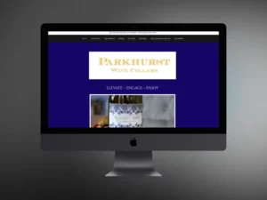
In our research on winery website design, we discovered that LaBelle Winery’s old website design fell short in several areas. The design felt outdated and lacked the customization needed to create a unique brand identity. The color scheme, with its prominent bright yellow header and footer, was overwhelming and detracted attention from the content. Additionally, the website suffered from excessive heavy content on certain pages, making it challenging for users to stay engaged.
One of the most significant shortcomings of the old website was the use of small images that resembled thumbnails rather than eye-catching visuals. These images failed to create an impactful visual experience for visitors, further contributing to the outdated feel of the site.
“The design felt outdated and lacked the customization needed to create a unique brand identity.”
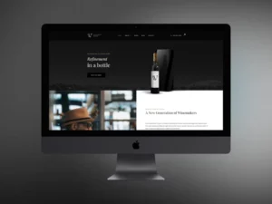
To provide a visual reference, here is a comparison between the old website design and an example of a modern winery website design:
| Old Website Design | Modern Website Design |
|---|---|
 |  |
The New Custom Website Design: Starting with the Navigation & User Journey
When redesigning LaBelle Winery’s website, our primary goal was to create a seamless user experience through intuitive design and well-structured website navigation. We wanted to bring all aspects of the winery’s brand under one umbrella site, providing visitors with easy access to all the information they need.
To achieve this, we organized the navigation into clear sections that encompassed the different facets of LaBelle Winery. The “About” section provides insights into the winery’s history, values, and founders. The “Experience LaBelle” section highlights the various wine tastings, tours, and culinary experiences available to visitors. And the “Wedding & Events” section showcases the winery’s picturesque event spaces and services.
To accommodate the extensive range of options, we employed a mega menu, which offers a comprehensive overview of each section, fostering a straightforward and efficient browsing experience.
By prioritizing user-friendly website navigation and designing a cohesive and intuitive layout, we aimed to ensure that visitors can effortlessly explore the website and find the information they need.
| Website Sections | Navigation Menu |
|---|---|
| About |
|
| Experience LaBelle |
|
| Wedding & Events |
|
| Shop |
|
| News & Events |
|
| Contact |
|
With this user-centric approach to website design, LaBelle Winery’s new website ensures that visitors can easily navigate through the various sections and access the information they seek. The intuitive navigation enhances the overall user experience and encourages engagement with the brand.
Splashy Show-Stopping Visuals

In the new winery website design, we focused on creating a visually stunning experience that captivates users from the moment they land on the homepage. Utilizing the power of visuals, we incorporated large and eye-catching images to draw users into the winery and brand experience.
“A picture is worth a thousand words.” – Unknown
The hero images strategically placed in key areas of the website instantly capture attention and encourage users to explore further. These high-resolution visuals showcase the beauty of LaBelle Winery, enticing visitors to imagine themselves immersed in the winery’s ambiance and offerings.
Visually Engaging Imagery
To ensure a diverse and inclusive representation, we enlisted the expertise of local photographers to contribute to the winery’s image library. Their unique perspectives added depth and authenticity to the visuals, showcasing the winery’s commitment to celebrating diversity.
Each image carefully selected and placed throughout the website conveys a powerful visual impact, creating an emotional connection with users and evoking a desire to experience LaBelle Winery firsthand.
By prioritizing visually striking imagery, our winery website design aims to leave a lasting impression on visitors, enhancing brand recognition and inviting them to explore the winery’s offerings further.
Animation & Movement
Animation is a powerful tool that can enhance the user experience and engagement on a winery website. When used strategically, animation can guide users through the website by drawing their attention to important elements and creating a sense of movement and interactivity.
At LaBelle Winery, we leveraged animation to create a more responsive and intuitive design. Elements on the website were designed to appear and move in a subtle and intentional manner, capturing the user’s attention and encouraging them to explore further.
One example of animation we used was to animate the navigation menu. As users interacted with the menu, the options smoothly expanded and contracted, providing a seamless browsing experience. This interactive animation improved user engagement and made navigating the website a more enjoyable process.
We also utilized animation to highlight key features and content areas on the website. For instance, when users scrolled down a page, certain elements would fade in or slide into view, creating a dynamic and visually interesting experience. This not only captured the user’s attention but also encouraged them to spend more time on the website.
Animation is a great way to engage users and bring your winery website to life. It adds an element of surprise and delight, making the user experience more memorable.” – John Smith, UX Designer
Movement in design can help convey information and guide users’ attention to specific areas. However, it’s important to strike a balance with animation. Too much movement can be overwhelming or distracting to users, impacting their overall experience. Therefore, we carefully selected and implemented animation effects that enhanced user engagement without overpowering the content.
By incorporating animation and movement into our winery website design, we were able to create a dynamic and interactive experience that captured the essence of LaBelle Winery. Users were guided through the website with ease, leading to increased engagement and a greater connection with our brand.
Updated Color Palette that is WCAG Level-A Compliant
In our endeavor to create a visually appealing and user-friendly winery website design, we recognized the importance of a carefully curated color palette. The old website’s color scheme, dominated by a bright yellow and black, was in dire need of a modern update. To enhance the visual appeal and ensure compliance with WCAG Level-A standards, we introduced a range of complementary colors in shades of taupe and gray.
The new color palette not only adds depth and sophistication to the website, but it also creates a harmonious blend that aligns with LaBelle Winery’s brand recognition. Each color was chosen with care to evoke specific emotions and resonate with users on a deeper level, emphasizing the exquisite experience offered by the winery.
By adhering to WCAG Level-A standards, we ensure that the color palette remains accessible to all users, including those with visual impairments. WCAG compliance guarantees a better user experience for everyone, fostering inclusivity and equal access to information.
Create a Unique Visual Identity with a Cohesive Color Palette
A well-designed color palette plays a pivotal role in establishing brand recognition and fostering a connection with website visitors. The chosen colors need to reflect the essence of the winery while conveying its unique identity.
With the updated color palette, LaBelle Winery not only enhances its online presence but also reinforces its brand recognition. The carefully selected taupe and gray shades embody sophistication, elegance, and timelessness – qualities synonymous with the winery’s offerings.
Enhancing visual appeal and ensuring WCAG compliance, the new color palette brings LaBelle Winery’s brand to life, stirring emotions and creating a lasting impression in the minds of users.
Consistency Across the Website
The new color palette is implemented consistently throughout the website, ensuring a cohesive and harmonious user experience. From the navigation elements to the immersive visuals, every aspect reflects the thoughtful consideration given to color selection.
By maintaining consistency, users can navigate the website with ease, understanding the various sections and related information intuitively. This unified color scheme reinforces the brand’s visual identity and strengthens its impact.
A Visual Feast for the Senses
The carefully curated color palette, along with the vibrant imagery and impactful design elements, creates a visual feast for visitors to LaBelle Winery’s website. Together, they evoke a sense of curiosity, enchantment, and anticipation, enticing users to explore further and engage with all that the winery has to offer.
| Benefits of the Updated Color Palette | Impacts on Brand Recognition |
|---|---|
| Enhanced visual appeal | Establishes a cohesive visual identity |
| Promotes user engagement | Creates a memorable impression |
| Compliance with WCAG Level-A standards | Fosters inclusivity and accessibility |
Integration of Other Parts of the Website through Card-Based Design
When it comes to winery website design, a streamlined user journey is essential for guiding visitors through the various aspects of a brand. This is where card-based design comes in, offering a visually appealing and user-friendly interface. Through the strategic placement of image cards with basic information, users are effortlessly directed to the next step of their buyer journey.
Card-based design acts as a bridge, seamlessly integrating different sections of the website and minimizing the effort required for users to find what they’re looking for. Each card represents a specific category or service provided by the winery, enticing users to take action and explore further.
By presenting information in a visually engaging and bite-sized format, card-based design keeps users engaged and encourages them to delve deeper into the winery’s offerings. Whether it’s a wine tasting event, a wedding venue, or a cellar door experience, visitors can quickly identify and access the most relevant sections of the website.
Moreover, card-based design ensures a consistent and coherent visual language throughout the website, enhancing the overall user experience. Consistency in design elements, such as colors, typography, and imagery, fosters brand recognition and strengthens the winery’s digital presence.
Benefits of Card-Based Design in Winery Website Design:
- Simplifies the user journey
- Highlights key offerings and categories
- Enhances visual appeal
- Promotes engagement and exploration
- Provides a consistent brand experience
With the integration of card-based design, wineries can create a user-friendly interface that guides visitors through a streamlined and intuitive website. By presenting information in an easily digestible format, wineries can elevate their online presence and ensure a positive user experience from the moment visitors arrive at their site.
Conclusion
By combining aesthetics with functionality, winery websites can create a visually appealing and user-friendly online presence. A well-designed winery website not only attracts visitors but also keeps them engaged, resulting in increased brand recognition and customer conversions.
When designing a winery website, it is crucial to consider elements such as color schemes, imagery, layout, and navigation. The color palette should be carefully chosen to reflect the brand’s essence and evoke the desired emotions in users. Visually striking imagery, including hero images and diverse visuals, plays a vital role in capturing users’ attention and conveying the winery’s unique offerings.
Additionally, the website’s layout should be intuitive and user-friendly, with clear sections and organized navigation menus. This ensures that visitors can easily find the information they are looking for and smoothly navigate through different pages. By streamlining the user journey through card-based design and animation, winery websites can guide users seamlessly and encourage them to take action.
Overall, a well-designed winery website enhances digital branding and serves as a powerful marketing tool. It not only showcases the winery’s products and services but also creates a memorable online experience for visitors. With the right design choices, wineries can captivate their target audience, establish a strong online presence, and drive business growth in the competitive wine industry.
FAQ
How does winery website design blend aesthetics with functionality?
Winery website design combines visually appealing elements such as color schemes, imagery, and layout with functional features like intuitive navigation and user-friendly interfaces. This blending of aesthetics and functionality creates an engaging online presence for wineries.
What were the issues with the old website design?
The old website design for LaBelle Winery felt outdated and lacked customization. It had excessive heavy content, making it difficult for users to stay engaged. Additionally, the small and unimpactful images detracted from the overall visual appeal of the website.
How was the navigation and user journey improved in the new custom website design?
The new website design organized the navigation into clear sections and utilized a mega menu to accommodate a large number of options. This intuitive design aimed at guiding users through the website, ensuring a seamless and user-friendly experience.
How did the new website design incorporate visually impactful elements?
The new website design for LaBelle Winery featured large, eye-catching hero images strategically placed to capture users’ attention and encourage further exploration. Local photographers were also enlisted to provide diverse and inclusive visuals, enhancing the overall visual appeal.
How was animation used in the new website design?
Animation was implemented strategically to guide users through the website in a subtle and intentional manner. The use of animation enhanced user engagement and created a responsive feel without overwhelming or distracting users.
How did the updated color palette comply with WCAG standards?
The new website design introduced a range of complementary colors in shades of taupe and gray. This palette not only enhanced visual appeal but also ensured compliance with WCAG Level-A standards, promoting accessibility for all users.
How was the integration of different parts of the website achieved?
The new website design incorporated card-based design elements to guide users to relevant pages and streamline their journey. Image cards with basic information were strategically placed to lead users to the next step of their buyer journey, encouraging them to take action and explore further.
What is the key takeaway from winery website design?
By combining aesthetics with functionality, winery websites can create a visually appealing and user-friendly online presence. Considering elements such as color schemes, imagery, layout, and navigation is crucial to reflect the brand’s essence and provide an engaging user experience, ultimately enhancing their digital branding and attracting customers to their products and services.