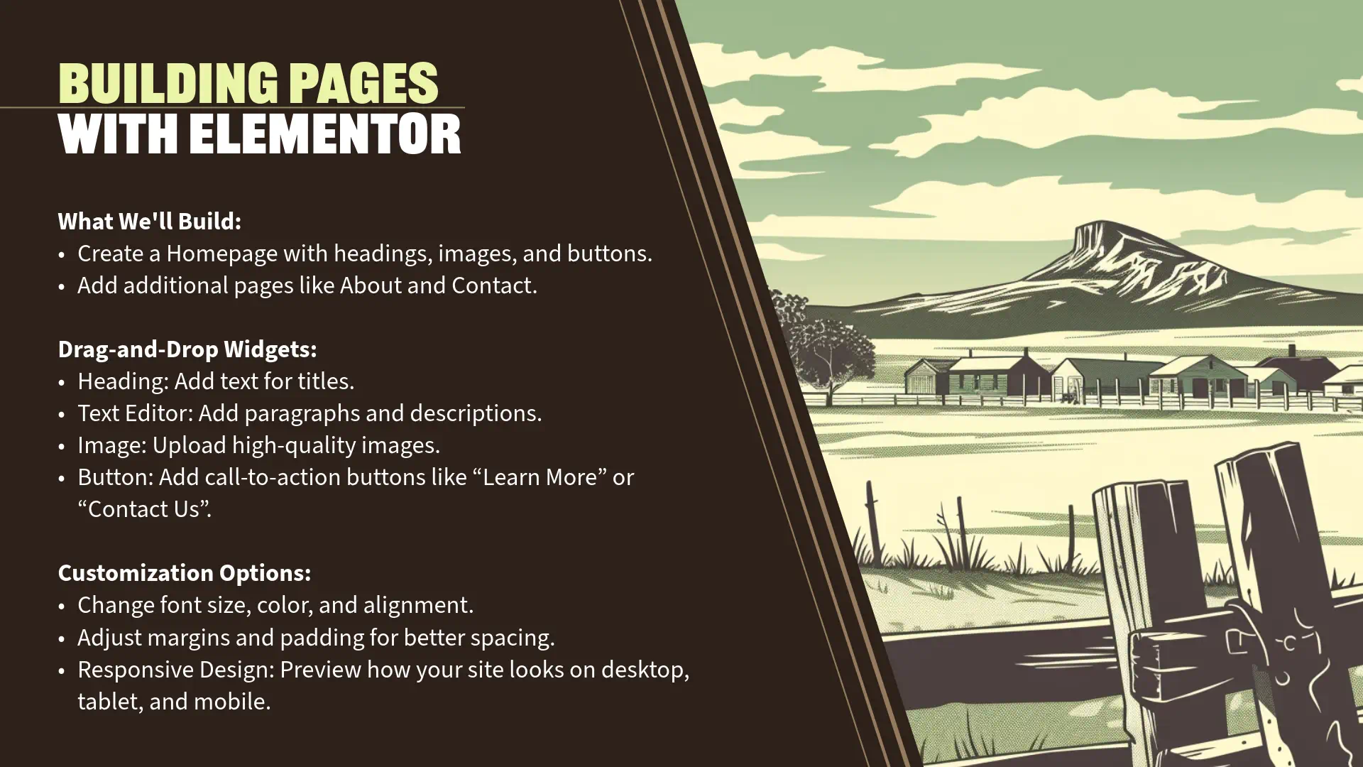
Section 7: Building Your Homepage with Elementor (15 minutes)
Creating a New Page
“Now that we have Elementor Pro installed and activated, we’re ready to start building our homepage. Let’s begin by creating a new page in WordPress.
Step 1: Navigate to Pages
- From your WordPress Dashboard, go to ‘Pages’ > ‘Add New’.
- This is where you can create new pages for your site, such as the homepage, about page, contact page, etc.
Step 2: Title Your Page
- In the ‘Add New Page’ screen, you’ll see a field at the top labeled ‘Add title’.
- Enter ‘Home’ as the title of your page.
- This helps identify the page within your dashboard and can be used in navigation menus.
- Enter ‘Home’ as the title of your page.
- Note: You can leave the content area blank since we’ll be designing the page using Elementor.
Step 3: Save the Page
- On the right-hand side, you’ll see the ‘Publish’ panel.
- Click ‘Publish’ to save your new page.
- You may need to click ‘Publish’ twice to confirm.
- Click ‘Publish’ to save your new page.
- Your page is now live, but currently blank.
Launching Elementor Editor
“With our ‘Home’ page created, let’s launch the Elementor editor to begin designing.
Step 1: Edit with Elementor
- After publishing the page, you’ll see a button labeled ‘Edit with Elementor’.
- Click on ‘Edit with Elementor’.
- Alternatively, from the ‘Pages’ list, hover over the ‘Home’ page and click ‘Edit with Elementor’.
- Click on ‘Edit with Elementor’.
- The Elementor editor will load, displaying a live preview of your page and the Elementor interface.
Understanding the Elementor Interface
“Before we start building, let’s familiarize ourselves with the Elementor interface to make the most of its features.
Main Components of the Interface:
- Widgets Panel (Left Side):
- Contains all the elements you can add to your page.
- Basic Widgets: Heading, Text Editor, Image, Video, Button, etc.
- Pro Widgets (with Elementor Pro): Form, Slides, Posts, Portfolio, etc.
- Search Bar:
- Quickly find widgets by typing in the name.
- Navigator:
- Accessed by right-clicking on an element or via the bottom toolbar, it provides a tree view of all elements on the page.
- Contains all the elements you can add to your page.
- Editing Area (Main Screen):
- Displays a live preview of your page as you build it.
- You can directly add, edit, and rearrange elements here.
- Top Toolbar:
- Elementor Icon (Top Left):
- Click to access the dashboard, settings, and global styles.
- Responsive Mode:
- Toggle between desktop, tablet, and mobile views to adjust design for different devices.
- Undo/Redo Buttons:
- Quickly reverse or reapply recent changes.
- Elementor Icon (Top Left):
- Bottom Toolbar:
- Settings (Gear Icon):
- Adjust page settings like title, status, and featured image.
- Navigator (Stack Icon):
- Open the navigator panel for easier element management.
- History (Clock Icon):
- View and revert to previous versions or actions.
- Responsive Mode (Monitor Icon):
- Another access point for switching device views.
- Preview Changes (Eye Icon):
- Open a new tab to preview the page as visitors will see it.
- Publish/Update Button (Green Button):
- Save your changes and make them live.
- Settings (Gear Icon):
Adding Sections and Widgets
“Let’s start building our homepage by adding sections and widgets.
Step 1: Add a New Section
- In the Editing Area, click the ‘+’ icon to add a new section.
- You’ll be prompted to choose a structure.
- Choose Structure:
- For now, select a two-column structure by clicking the second option with two columns.
- A new section with two columns is added to your page.
Step 2: Add Widgets to the Section
- Drag and Drop Widgets:
- From the Widgets Panel, click and drag the ‘Heading’ widget into the column.
- You’ll see a blue highlight indicating where the widget will be placed.
- Next, drag the ‘Text Editor’ widget below the heading.
- Add the ‘Icon List’ widget below the text
- Finally, add a ‘Button’ widget below the image.
- Add an ‘Image’ widget to the right column.
- From the Widgets Panel, click and drag the ‘Heading’ widget into the column.
Customizing Content
“Now, let’s customize each widget to create meaningful content.
Step 1: Edit the Heading
- Select the Heading Widget:
- Click on the heading text in the Editing Area.
- Edit Content:
- In the Widgets Panel, under the ‘Content’ tab, replace the default text with ‘Welcome to Applegate Pumpkins’.
- Style the Heading:
- Click on the ‘Style’ tab.
- Typography:
- Click on ‘Typography’ to adjust font settings.
- Font Family: Choose a font that matches the theme (e.g., Orelega One).
- Size: Set the font size (e.g., 48px).
- Weight: Choose ‘Bold’ or ‘600’ for emphasis.
- Text Color:
- Click on the color picker and select a dark gray color (e.g., #54595F).
- Click on ‘Typography’ to adjust font settings.
- Typography:
- Click on the ‘Style’ tab.
Step 2: Edit the Text Editor
- Select the Text Widget:
- Click on the paragraph text below the heading.
- Edit Content:
- In the ‘Content’ tab, enter a brief description:
- ” Experience the beauty and bounty of Applegate Valley at our family-owned organic pumpkin farm.”
- In the ‘Content’ tab, enter a brief description:
- Style the Text:
- Under the ‘Style’ tab:
- Typography:
- Adjust font size (e.g., 18px) for readability.
- Choose a complementary font (e.g., Open Sans).
- Text Color:
- Use a neutral color (e.g., dark grey or brown) for readability.
- Typography:
- Under the ‘Style’ tab:
Step 3: Add an Image
- Select the Image Widget:
- Click on the image placeholder.
- Choose an Image:
- In the ‘Content’ tab, click on ‘Choose Image’.
- Upload an image from your computer or select one from the Media Library.
- For this demonstration, select the image of a pumpkin farm.
- Adjust Image Size:
- Under ‘Image Size’, choose ‘Large’ or a custom size that fits your design.
Step 4: Edit the Text Editor
- Select the Text Widget:
- Click on the paragraph text below the heading.
- Edit Content:
- In the ‘Content’ tab, enter a brief description:
- ” Family-Owned Organic Pumpkin Farm”
- Highlight the text and make it bold by clicking ‘B’
- In the ‘Content’ tab, enter a brief description:
Step 5: Edit the Icon List
- Customize the Icon List
- Delete the second two items, keeping the checkmark.
- Duplicate the checkmark twice
- Add the content to each item
- “Dedicated to cultivating the finest pumpkins.”
- “Nurtured by Oregon’s rich soil.”
- “Committed to sustainable farming practices.”
Step 5: Customize the Button
- Select the Button Widget:
- Click on the button placeholder.
- Edit Content:
- In the ‘Content’ tab:
- Text: Change the button text to ‘Learn More’.
- Link: Enter a URL where the button should lead (e.g., ‘/about’ or another page you’ll create).
- In the ‘Content’ tab:
- Style the Button:
- Under the ‘Style’ tab:
- Typography:
- Adjust font size (e.g., 16px).
- Text Color and Background Color:
- Set the text color to dark gray.
- Set the background color to match the image color (e.g., #CCCB96).
- Hover Effects:
- Under ‘Hover’, set the box shadow to all zeros to create an interactive effect.
- Typography:
- Under the ‘Style’ tab:
Designing Layouts
“To enhance the visual appeal, let’s adjust the layout and background.
Step 1: Adjust Column Widths (if using multiple columns)
- Add a New Section with Two Columns:
- For variety, let’s add another section with two columns.
- Click the ‘+’ icon and select the two-column structure.
- Adjust Column Widths:
- Hover over the column border until you see the column resize icon.
- Click and drag to adjust the width ratio (e.g., 70% / 30%).
Step 2: Change Background Colors and Images
- Edit Section Settings:
- Hover over the section and click on the ‘Edit Section’ icon (six dots at the top center).
- Background Settings:
- In the Widgets Panel, under the ‘Style’ tab, you can set a background for the section.
- Background Type:
- Choose ‘Classic’.
- Color: Select a soft, warm color (e.g., light orange or beige).
- Image: Alternatively, you can upload a background image.
- Choose ‘Classic’.
- Background Overlay:
- Add an overlay to enhance text readability over images.
- Background Type:
- In the Widgets Panel, under the ‘Style’ tab, you can set a background for the section.
Step 3: Add Padding and Margins
- Spacing:
- Under the ‘Advanced’ tab of the section or widget, you can adjust padding and margins.
- Padding: Adds space inside the element.
- Margin: Adds space outside the element.
- For example, add padding to the section to increase space around the content (e.g., 50px top and bottom).
- Under the ‘Advanced’ tab of the section or widget, you can adjust padding and margins.
Responsive Design
“Ensuring your website looks great on all devices is crucial.
Step 1: Switch to Mobile View
- Responsive Mode:
- At the bottom of the Widgets Panel or top toolbar, click on the ‘Responsive Mode’ icon (monitor icon).
- Select ‘Mobile’ to view how your page looks on a mobile device.
Step 2: Adjust Elements for Mobile Responsiveness
- Customize Mobile Layout:
- Heading Size:
- Select the Heading widget.
- Under ‘Style’ > ‘Typography’, adjust the font size specifically for mobile (e.g., 32px).
- Click on the device icon next to the font size to set different values for desktop, tablet, and mobile.
- Image Size:
- Ensure images scale appropriately.
- Button Alignment:
- Center-align buttons for better mobile aesthetics.
- Heading Size:
Step 3: Check Tablet View
- Switch to ‘Tablet’ view and make any necessary adjustments, similar to mobile.
Step 4: Preview and Test
- Click the ‘Preview Changes’ (eye icon) to see how your page looks in a new tab.
- Test the responsiveness by resizing your browser window or viewing on actual devices if possible.
Engagement Opportunity
Designing your homepage is an exciting process that allows you to express your creativity and connect with your audience.
- Think About Your Audience:
- What information are they seeking when they visit your homepage?
- How can you engage them within the first few seconds?
- Use High-Quality Images:
- Visuals are powerful. Use images that are relevant and high-resolution to captivate visitors.
- Consistent Branding:
- Maintain consistent use of colors, fonts, and styles that reflect your brand identity.
Personal Insights
“For the Applegate Pumpkins homepage:
- Capturing the Essence:
- We used warm autumn colors and images of pumpkin patches to evoke the seasonal atmosphere.
- Clear Call to Action:
- The ‘Plan Your Visit’ button encourages visitors to learn more and engage with the site.
- User Experience:
- By ensuring mobile responsiveness, we’re making sure visitors have a positive experience regardless of the device they use.
Saving and Publishing
“Once you’re satisfied with your design:
- Save Your Work:
- Click the ‘Update’ button (previously ‘Publish’ if it’s the first time) to save your changes.
- Preview the Page:
- Use the ‘Preview Changes’ option to see your live page.
Transition to Next Section
“Great job! We’ve successfully built a visually appealing and functional homepage using Elementor.
In the next section, we’ll create additional pages like ‘About’ and ‘Contact’ to provide more information to your visitors. We’ll also explore how to use Elementor templates to streamline the design process.
Let’s continue building our website and enhancing the user experience!”


