Section 9: Setting Up Navigation Menus (5 minutes)
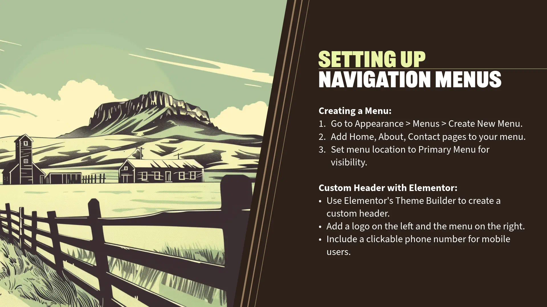
Creating a Menu
“Now that we have our key pages created, it’s essential to set up a navigation menu to help visitors easily navigate your website. Instead of using the default theme location, we’ll leverage Elementor’s Theme Builder to create a custom header that includes your logo, navigation menu, and a clickable phone number for immediate contact.
Adding a Phone Number as a Custom Menu Item
Step 1: Edit the ‘Main Menu’
- From your WordPress Dashboard, navigate to ‘Appearance’ > ‘Menus’.
- If you haven’t created a menu yet, follow these steps:
- Create a Menu:
- Enter ‘Main Menu’ in the ‘Menu Name’ field.
- Click ‘Create Menu’.
- Create a Menu:
- If you haven’t created a menu yet, follow these steps:
- Add Pages to the Menu:
- In the ‘Add menu items’ section, select ‘Pages’.
- Check the boxes next to ‘Home’, ‘About’, and ‘Contact’.
- Click ‘Add to Menu’.
- Add Phone Number as a Custom Link:
- Click on ‘Custom Links’ in the ‘Add menu items’ section.
- URL:
- Enter tel:(555)123-4567.
- This creates a clickable link that initiates a phone call on devices that support telephony links (like smartphones).
- Enter tel:(555)123-4567.
- Link Text:
- Enter (555) 123-4567.
- URL:
- Click ‘Add to Menu’.
- Click on ‘Custom Links’ in the ‘Add menu items’ section.
- Arrange Menu Items:
- In the ‘Menu Structure’ area, drag and drop the menu items to arrange them:
- Place the phone number at the end or in a prominent position that makes sense for your site.
- In the ‘Menu Structure’ area, drag and drop the menu items to arrange them:
- Save the Menu:
- Click ‘Save Menu’ to apply your changes.
Creating a Custom Header with Elementor Theme Builder
Step 2: Access Elementor Theme Builder
- Navigate to ‘Templates’ > ‘Theme Builder’ in your WordPress Dashboard.
- Click on ‘Add New’ and select ‘Header’ from the dropdown menu.
- Name Your Template:
- Enter a name like ‘Main Header’ for easy reference.
- Click ‘Create Template’.
- Name Your Template:
Step 3: Build the Header Structure
- Close the Template Library:
- If prompted with pre-designed templates, you can choose one or close the library to start from scratch.
- Add a New Section:
- Click the ‘+’ icon to add a new section.
- Choose a Two-Column Structure:
- Select the structure with two columns.
- This allows you to place the logo on the left and the menu (with phone number) on the right.
- Select the structure with two columns.
Step 4: Insert the Site Logo
- Drag the ‘Site Logo’ Widget:
- From the Widgets Panel on the left, find the ‘Site Logo’ widget (under ‘Site’ or ‘Theme Elements’).
- Drag it into the left column.
- Configure the Logo:
- Content Tab:
- If you have set a logo in your site’s settings, it will display automatically.
- If not, click ‘Choose Image’ to upload your logo.
- Style Tab:
- Adjust the width, max width, and alignment as needed.
- Set the padding and margin under the ‘Advanced’ tab for proper spacing.
- Content Tab:
Step 5: Insert the Navigation Menu
- Drag the ‘Nav Menu’ Widget:
- Locate the ‘Nav Menu’ widget (available with Elementor Pro).
- Drag it into the right column.
- Select Your Menu:
- In the ‘Content’ tab, choose ‘Main Menu’ from the ‘Menu’ dropdown.
- Set Layout and Alignment:
- Layout:
- Choose ‘Horizontal’.
- Align:
- Set the alignment to ‘Right’.
- Layout:
- Style the Menu:
- Navigate to the ‘Style’ tab.
- Typography:
- Adjust the font family, size, weight, and color to match your site’s branding.
- Dropdowns and Mobile Menu:
- Customize if you plan to have submenus or need mobile responsiveness.
- Typography:
- Navigate to the ‘Style’ tab.
Step 6: Ensure the Phone Number Appears Correctly
- The phone number added as a custom link in your menu will now display alongside your other menu items.
- Style the Phone Number:
- While Elementor’s ‘Nav Menu’ widget styles all menu items uniformly, you can use custom CSS to style the phone number differently if desired.
- Optional – Add an Icon Next to the Phone Number:
- To make the phone number stand out, you can add a phone icon:
- In ‘Appearance’ > ‘Menus’, expand the phone number menu item.
- Enable ‘CSS Classes’ via ‘Screen Options’ at the top if not already visible.
- Add a CSS class like ‘phone-number’.
- Back in Elementor, you can use custom CSS to target this class and add a background image or icon.
- To make the phone number stand out, you can add a phone icon:
Step 7: Make the Header Responsive
- Switch to Mobile View:
- Click on the ‘Responsive Mode’ icon (monitor icon) at the bottom left.
- Select ‘Mobile’.
- Adjust Mobile Menu Settings:
- In the ‘Nav Menu’ widget settings:
- Content Tab:
- Under ‘Layout’, ensure ‘Dropdown’ or ‘Toggle’ is selected for mobile devices.
- Customize the ‘Toggle Button’ if you prefer a different icon or style.
- Content Tab:
- Style Tab:
- Adjust typography, spacing, and colors for the mobile menu.
- In the ‘Nav Menu’ widget settings:
- Check the Logo Alignment:
- Ensure the logo is appropriately sized and aligned on mobile devices.
- Adjust Spacing:
- Use the ‘Advanced’ tab to adjust padding and margins for elements on mobile.
Step 8: Publish the Header Template
- Click ‘Publish’:
- After completing the header design, click the ‘Publish’ button.
- Set Display Conditions:
- When prompted, set the display conditions:
- Include > Entire Site
- This ensures the header appears on all pages.
- Include > Entire Site
- Click ‘Save & Close’.
- When prompted, set the display conditions:
Verifying the Custom Header on Your Site
Step 9: View Your Site
- Visit the Front End:
- Navigate to your site’s homepage.
- Check the Header:
- Ensure the logo is on the left, and the menu items, including the phone number, are on the right.
- Test the Phone Number Link:
- On a mobile device, tap the phone number to see if it prompts a call.
- On desktop, clicking the link may prompt you to choose an application to make the call.
- On a mobile device, tap the phone number to see if it prompts a call.
Step 10: Final Adjustments
- Fine-Tune Design:
- If any elements need adjustment, return to the Elementor editor via ‘Templates’ > ‘Theme Builder’.
- Edit the header template and make necessary changes.
- Update and Refresh:
- Click ‘Update’ after making changes.
- Refresh your site to see the updates.
Engagement Opportunity
“Creating a custom header using Elementor’s Theme Builder offers several advantages:
- Brand Identity:
- A custom header allows you to align the design closely with your brand, enhancing recognition.
- Enhanced Functionality:
- Including a clickable phone number directly in the header makes it easy for visitors to contact you, potentially increasing conversions.
- Improved User Experience:
- A well-designed header with clear navigation helps visitors find information quickly and encourages them to explore your site further.
Personal Insights
“For our Applegate Pumpkins website:
- Accessibility:
- Having the phone number prominently displayed ensures visitors can easily reach out for event information or inquiries.
- Mobile-Friendly Design:
- Since many users access websites on mobile devices, a responsive header with a clickable phone number enhances usability.
- Visual Appeal:
- Placing the logo prominently reinforces brand identity and gives a professional appearance.
Tips for a Successful Header Design
- Consistency:
- Use consistent colors, fonts, and styles to maintain a cohesive look across your site.
- Simplicity:
- Keep the header clean and uncluttered to avoid overwhelming visitors.
- Hierarchy:
- Prioritize elements based on importance—logo, navigation menu, and contact information.
- Testing:
- Always preview your header on different devices to ensure it looks and functions as intended.
Transition to Next Section
“Fantastic work! You’ve now set up a custom header that not only enhances the visual appeal of your website but also improves functionality by making navigation and contact options readily accessible.
In the next and final section, we’ll focus on adding the finishing touches and preparing your site for launch. We’ll customize the footer, review the site to ensure everything is in place, and discuss basic SEO settings to enhance your site’s visibility.
Let’s proceed to get your website ready for the world!”


